
WRITTEN, DESIGNED & SHOT ON iPHONE BY: STEVE HOLLOWAY
Adding words to images to tell a story is like adding dialog to a movie. And, putting images and words together is more effective than either one alone.
There are automated options in apps and social media post tools to add words to images that are easy and accessible for users at any skill level.
Or, if you want a unique visual identity, you can create your own type and graphics.
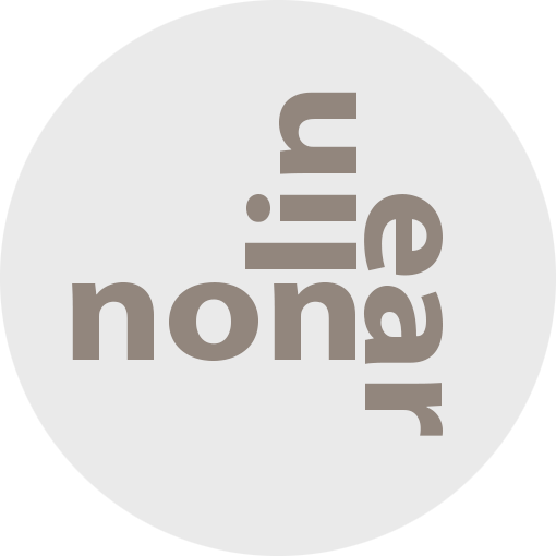
This post is a deep dive into the type fonts and design created and used throughout Nonlinear Content, Point of View and the parent page Drop Top Road Trips.

If you already use Photoshop or Photoshop Elements, you have everything you need to create text/graphics to use with or add to your images.
Start with type fonts. The type fonts you choose to use and how you use them become an essential part of moving the story forward.
Here are five type faces I use throughout Nonlinear Content and Drop Top Road Trips.
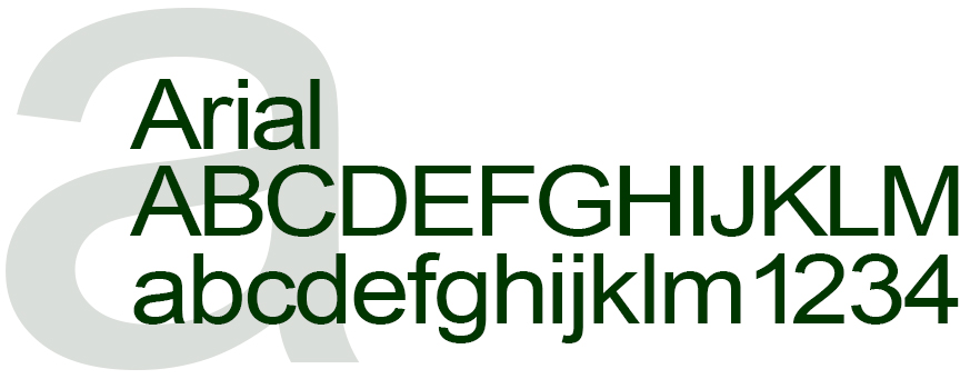
Arial is a sans-serif font released in 1982 by Monotype Corporation. It is based on Helvetica, a similar sans-serif font released by Haas Type Foundry in 1957. This universal, readable font is available on Microsoft and Apple devices, social media sites and web site authoring software.
It is my go-to font for headlines and body copy and for social media and blog pages.
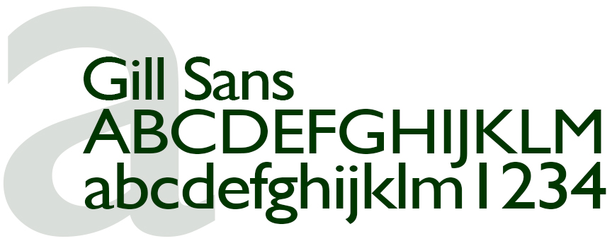
Gill Sans was released in 1928 by the Monotype Foundry. Gill Sans is a sans-serif font, a precursor to mid-century modernism. I use Gill Sans as formal contrast to other fonts.
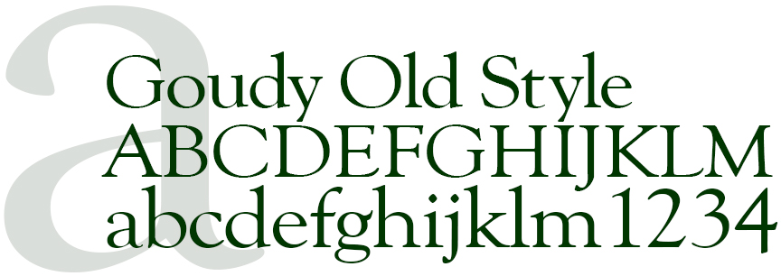
Released in 1915 by American Type Founders, Goudy Old Style is a serif font reminiscent of Bodoni, a late eighteenth century font. It can stand on its own or mix with san serif fonts.
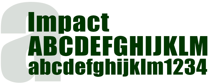
Created in 1965, Impact is a san-serif font released by Stephenson Blake foundry. This is a bold, compact, readable font that I use to communicate long copy headlines in a limited space.
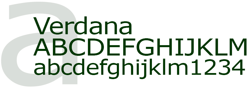
Verdana is a modern san-serif font released in 1996 by Microsoft Font Bureau. I use Verdana for the Drop Top Road Trips logo and as contrast to other serif and san-serif fonts.

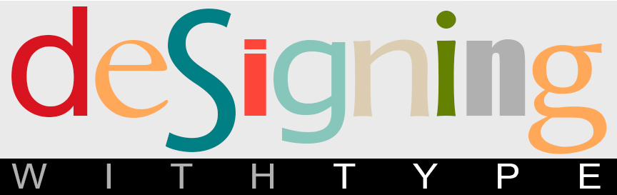
Adding words and design to images.
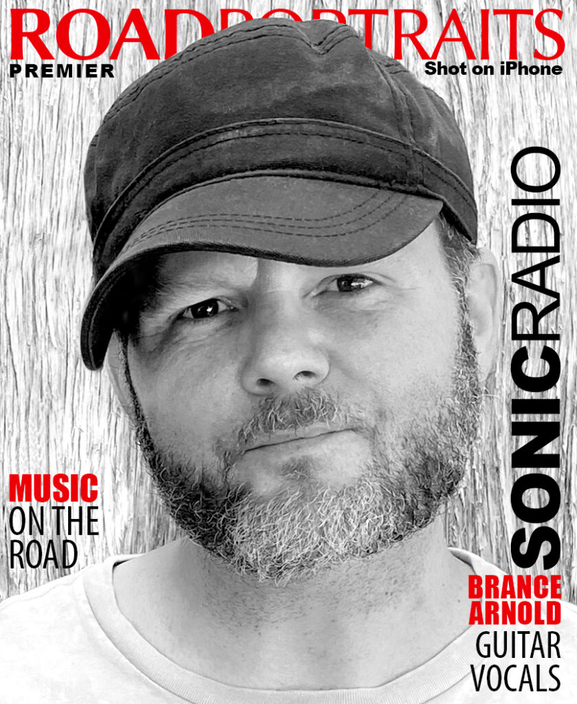
The Road Portraits cover brings type, design, words and imagery together by juxtaposing Brance Arnold’s portrait with the masthead graphics and design. This combination mixes fonts and font sizes to communicate the digital publication name, that it’s the premier issue, that Road Portraits is Shot on iPhone and that the lead story brings the reader music on the road by Sonic Radio.
In addition to Arial and Impact, I added two additional fonts that I use exclusively for Road Portraits designs.
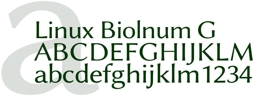
For the Road Portraits masthead, I added Linux Biolnum G. Linux Biolnum G is a modern, unique san-serif font released in 2003 by Libertine Open Fonts Projects.
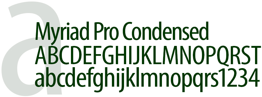
I also added Myriad Pro Condensed to use on its own and to contrast Impact. Released in 1992 by Adobe Type, Myriad Pro Condensed is a modern, compact font.
The Drop Top Road Trips masthead image/graphic uses Impact and Verdana merged with the blog key image.

The Images & Stories from the road graphic is an anchor image on the main About Page of Drop Top Road Trips. To add a unique look to the graphic, Baskerville was added to the type pallet and used for the phrase “from the road”. The graphic also includes Verdana, the Drop Top Road Trips logo type.
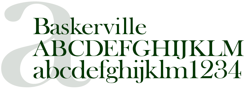
Baskerville is a serif type that brings an old world nuance to a design. Baskerville was designed in the 1750s and released by G. Peignot et Fils Foundry.
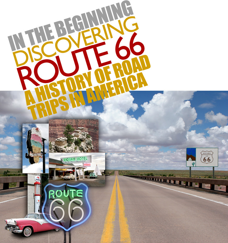
The Discovering Route 66 graphic incorporates Gill Sans with Impact.

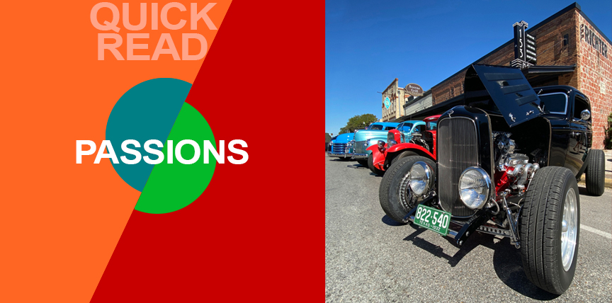
What are Your Passions?
One of my passions is vintage cars. If there’s a vintage car show is within driving distance, we’re there. Photographing what you’re passionate about instinctively adds a unique point of view to the images.
This 1932 Ford Deuce Coupe (above) was photographed at the 2021 Key to the Hills Rod Run car show. Captured on an iPhone 11 Pro Max with Beastgrip and Bluetooth shutter release in natural light. Camera was positioned at headlight level.


Jump to any Point of View how to guide, process deep dive or a pre iPhone portfolio plus how influences shape the storytelling process and a memoir that looks at the story behind the stories and to Nonlinear Content galleries and stories.

Introduction
Become a storyteller
Technology
- 02A Digital evolution.
- 02B Annie Leibovitz.
- 02C From Batman to the iPhone.
- 02D Henri Cartier-Bresson’s Leica.
- 02E Moving from film to digital to iPhone.
- 02F The self portrait series.
- 02G iPhone camera rigging.

- 03A Working with light.
- 03B The scout.
- 03C Shooting during the golden hour.
- 03D Photographing people.
- 03E Details, shadows, shapes and textures.
- 03F Plate shots and reflections.
- 03G Feed your passions.
- 03H People and food, two favorites.
- 03I On the road.
- 03J Wall art (it’s not what you think).
- 03K Transitional images.
- 03L Night photography.

- 04B Assemblages and abstractions.
- 04C Change the composition of an image.
- 04D Color correction vs color grading.
- 04E Create motion with Live Photo.
- 04F Resize images and retain detail.
- 04G Software and skill building resources.
- 04H On device apps.
- 04I Offboard resources.

- 05A Two key iPhone features.
- 05B Camera and light kit ideas.
- 05C Copied on iPhone.
- 05D Learning post production.
- 05E Designing with type.
- 05F Learning from cinema.
- 05G The three lens solution.